Studio 100 GO — A personalised experience for children’s entertainment
Key takeaways
The Studio 100 GO app is an entertainment hub for children from 0 to 12 years old, featuring series, films, music, books, and games from iconic Studio 100 brands such as Bumba, K3, Samson en Gert, Piet Piraat, De Nachtwacht, … .
-
Client
Studio 100
-
Services
User interface design — Content hubs and headless CMS — Interfaces for media & games — Interfaces for kids —
-
Links
Discover Studio 100 GO
Challenge
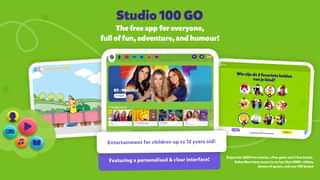
As the app is meant to be enjoyed by children until the age of 12, it is imperative for the end user that the interface is clear and focussed. The renewed version of the GO app is more child-friendly, clearer, personalised, and features content lanes that speak to your actual interests (based on your favourite characters).
In short, by improving on each one of these core features, the app now features a more polished overall structure and experience for the end user.
This also applies to the Studio 100 team internally, as we implemented some front-end changes across the board. The new system and its structure are more clear and consistent overall. The Studio 100 content & community team have access to a brand new admin interface which enables them to quickly and easily highlight new content, create top topicals, and adjust personalisation variables.
These changes underscore our overall approach to digital product design. The ideas and solutions we like to bring forward are always meant to hit both business and end-user objectives for noticeable improvements across the board. By creating a new kind of user experience for both app users and community managers, we’re able to hit both B2B and B2B2C objectives with real impact on admin efforts and time spent in the app.

Personalisation
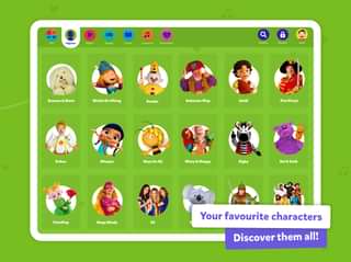
The main purpose of the improved personalisation is for users to be able to discover new content more easily, in order to increase value for the end user and increase time spent in the app. It’s also a valuable step in the right direction in further modernising the app by getting rid of simpler grids and instead presenting the different types of content in different lanes.
Solution
A lot of thought, care, and many discussions went into our approach to personalisation: We ended up creating a weighted brand matrix based on several personas. In terms of the user interface, we introduced new lane designs that cover personalised items and content.
The app was also due some technical improvements in the form of a new back-end setup using the most recent technologies, as we noticed the existing setup was suffering from certain limitations. We also proposed some more efficient hosting changes and have managed to cut costs down to half of the previous setup.
The interactive system was well put together already, partly thanks to our previous work where we designed and created several games for the GO app.

Result
The new version of the app was launched just before the 2021 Christmas holidays. So far, users are overwhelmingly positive about the improved user experience.
The interface is clearer, less crowded, and overall much more structured, meaning the Studio 100 team was able to cut down on content management costs and have a much better experience day-to-day!
